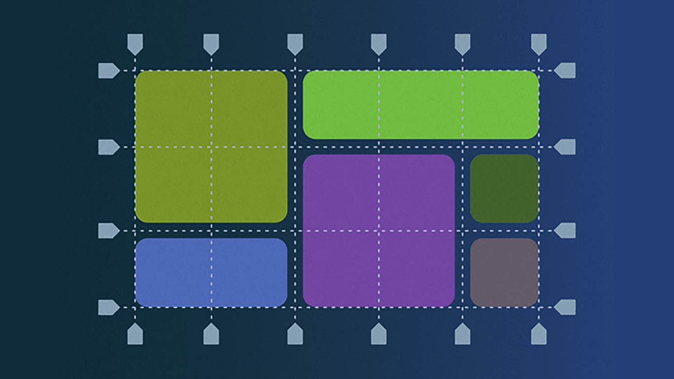
Grid columns and gap are essential features in CSS for creating responsive layouts. With the advent of CSS Grid, it has become easier than ever to create complex grid-based layouts that adjust to different screen sizes.
Grid Columns:
CSS Grid allows you to define a grid container and divide it into rows and columns. To create columns, you can use the grid-template-columns property. This property allows you to specify the width of each column in the grid. You can use different units like pixels, percentages, ems, or fractions to define the width of the columns.
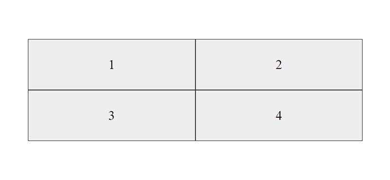
Here’s an example of creating a simple grid with two columns:
In the example above, we have defined a grid container and specified that it should have two columns with a width of 1fr each. The `fr` unit is a fractional unit that divides the available space into equal parts.
Gap:
The gap property in CSS Grid allows you to add space between rows and columns in the grid. This property is particularly useful for creating responsive layouts that adjust to different screen sizes. You can use any unit like pixels, ems, or percentages to define the gap between rows and columns.
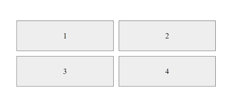
Here’s an example of adding a gap between rows and columns:
In the example above, we have added a gap of 20 pixels between rows and columns in the grid. This will create a space of 20 pixels between each column and each row.
Conclusion:
CSS Grid columns and gap properties are powerful tools for creating responsive layouts in CSS. With these properties, you can define the width of columns and add space between them, creating flexible and dynamic layouts that work across different screen sizes. By using these properties, you can create stunning grid-based designs that are both functional and visually appealing.


